Definition
Motion design (or animation design) is a technique that consists of animating graphic elements. Its particularity is to use the potential of movement as the main animation tool. For several years, motion design has been on the rise: it is the new video trend in Content Marketing and Brand Content. The growing public appeal for audiovisual content makes motion design a real opportunity for brands.

Why do the Motion Design?
Used by hundreds of brands to strengthen their marketing and communication actions, motion design offers many advantages.
Motion design is an easy-to-remember format
Usually, a motion design is a format that lasts less than 2 minutes. The goal is to get a message or specific information to a target audience. At a time when our attention span is reduced, its short format makes it easier for your target to memorize and assimilate the message.
Video is a viral format, the superstar of social networks
In 2020, 7 in 10 consumers prefer this format to text to discover a product or service, and 90% of them say that video helps them make a purchasing decision. Also, video is one of the formats that perform the best on social networks, especially on Facebook or LinkedIn. For example, a Facebook video has on average 135% higher organic reach than a photo.
Motion design is an inexpensive animation technique
The price of a motion design video depends on many factors. Advanced formats integrating animated illustrations (motion graphics) produced by hand by illustrator, stop-motion, or special effects require a certain financial investment. But compared to other forms of animation (cartooning for example, or making a video with real actors), motion design is less complex to produce and therefore less expensive.
Motion design makes it possible to popularize complex information
The main interest of motion design is its ability to transform a priori complex content into simple, visual, and understandable content by all. Animating images allows you to popularize a lot of information in record time and thus make you better understand your target. Motion design, therefore, fits perfectly into B2B content marketing strategies, whose content is often less sexy than in B2C.
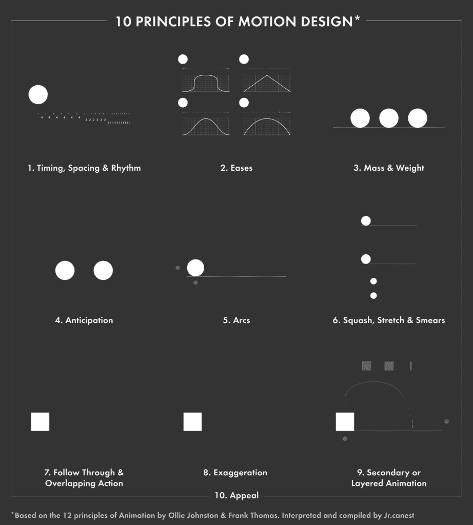
The 10 principles of Motion Design
Imagined by Franck Thomas and Ollie Johnston, close collaborators of the famous Walt Disney, these 10 animation principles will help you understand the meaning of movements, and produce animations as close as possible to reality.
1.The timing, space, the rhythm
The design of a movement is based on our relationship to time. Time is used to change the frame rate of the animation, to change the way objects move according to the rhythm of the audio. Time also allows you to modify the speed at which an element will change thanks to the curves of the animation.
2.The fluidity of movement
How does the technique allow us to translate the creative idea? The fluidity of the movement makes it possible to control the effect that the animation will have on the consumer’s emotions.
3.Volume and weight
In the real world, the movement of an object is dictated by its volume and weight. You must therefore take into account the weight of the object to define the intensity of a movement (for example, it will take more force for a car to stop than for a bicycle). The principle is the same for animating abstract images: you have to think about their weight and volume to define how they move.
4.Anticipation
When we move, the part of our body that moves first moves in the opposite direction to gain momentum. For example, if you are throwing a volleyball ball, you will first bend your arms slightly back and then push the ball up. Do not forget these anticipatory movements, which give naturalness to the animation and guide the viewer by indicating where he should focus his attention.
5.The arched trajectory
In space, there is no such thing as a straight line: every movement is affected by a series of disruptive elements such as gravity or momentum. To make your animation more realistic, add arcuate trajectories to the movements of your images.
6.Crushing and stretching
The more an object moves, the more the forces it encounters (ground, air, etc.) affect its shape. Making your object or illustration malleable helps to set the tone and make your animation more lively.
7.Tracking and overlap
On the same principle as anticipation, a movement that requires great force requires a lot of force to stop it. This results in a series of overlapping movements, during and after the action. To be as close as possible to reality, your animation must make these movements perceptible.
8.Exaggeration
Abstract animation is by definition artificial. How do you make it as real as possible in the eyes of the consumer and ensure that it holds their attention, as a real person would? The answer is in the exaggeration of movements.
9.Secondary actions
A line of text, a square specifying key information: simple things can quickly become boring. To reinforce the messages you want to convey thanks to these secondary elements, do not hesitate to add relief and movements supporting the main movement.
10.Attractiveness
It is a simple principle but extremely important. When you create an animation, you may well put all your efforts into the intelligence of the animation and the texts, if the final rendering does not interest the viewer, the latter will not look at your motion design. The purpose of motion design is to communicate on subjects and ideas that are not always super sexy or easy to access. Make sure you make them attractive!

What is a Motion Designer?
A Motion Designer is a graphic designer, designer, or art director who has chosen to specialize in motion design. Its role is to design and then produce animated content, using illustrations, 2D animation, 3D animation, sounds, or even typography.
What is the profile of the Motion Designer?
The Motion Designer combines technical skills and creative skills. He must be able to create illustrations and then design the animation. Like any creative, he spends a lot of time getting inspiration from sites like Behance or Dribble and updating his technical skills regularly.
What is the scope of the Motion Designer?
The scope of a Motion Designer depends on the level of maturity of the company, often related to its size: for example, a large group will have many more visual elements to provide to the Motion Designer than a startup that starts.
In practice, the Motion Designer is found in 3 types of situations:
- The brand already has a defined illustrative style: that is to say a clear visual identity (graphic charter, typography, etc.), but also precise graphic variations intended for different media. In this case, the Motion Designer creates illustrations in the style that is already defined, before taking care of the animation.
- The brand already has all the illustrations created: it’s very rare, but some large groups already have a library of illustrations such that the Motion Designer can use and go directly to animation.
- The brand does not have an illustrative style: the Motion Designer will then suggest one or two graphic styles to be validated, before proposing and creating the illustrations and animation.
What types of projects do you use a Motion Designer for?
There are many projects for which the Motion Designer is called upon. However, for their marketing and communication, brands often call on a Motion Designer for two types of needs:
- The release of a new product or service: motion design makes it possible to present a product or service that is a priori complex by explaining in a simple way how it works, the different use cases, or even the problems to which the product or service responds.
- Awareness campaigns: like an animated infographic, motion design makes it easy to put key information (figures and statistics in particular) forward to raise awareness about a cause or get a message across.
The vocabulary of motion design
For beginners and insiders alike, here’s a reminder of the key phrases needed when working on motion design projects.
- After Effects: Name of the Adobe suite software used for motion design.
- Flat design: Name given to an illustrative style widely used in motion design. As the name suggests, it is 2D, does not use perspective, and is minimalist (no reflections, shine, etc.).
- Isometric: Name was given to an illustrative style using a very specific type of axonometric perspective.
- Encode: Reduce the size of a video (change from a .mov file to .mp4)
- Sound design: Matches the sound design in a motion design video.
- Intro / Outro: Name was given to screens that introduce or conclude a video. Often, this is a title card for the intro, and a card containing the brand’s logo and/or a redirect to its social networks for the outro.
- Smoothing speeds: Name given to the action of making animation more fluid by giving a progressive aspect (increasing or decreasing) to its speed, between its start and its end.
- Composition: Name given to an assembly, a group of elements. Example: An animated character drinking coffee, with the word “coffee” appearing above him. These elements can be grouped to form a “composition”, which can then be placed on a screen, alongside other compositions.
- Opacity: Degree of opacity/transparency of an element
- Scale: Size of an element. It can go from 0 to 100% for an appearance, or from 100 to 0% for a disappearance.
- Position: Location of an element. An item that moves on the screen changes position.
- MP4: format or extension of an exported and encoded video file. This is a lightweight format.
How to do motion design in 8 steps?
Step 1: The creative brief – specifications
The brief is the reference document that presents all the information necessary to understand the project and your needs. It is the basis of your motion design. Without a good brief, you are sure to waste time on all of the steps that follow. What elements should your brief contain?
- The goal: Why do you want to make a motion design video animation? What will you use it for? What is the aim?
- The minimum and maximum duration of the motion design
- The target: who do you want to reach? Depending on whether the video is aimed at employees, prospects or customers, marketing managers, or bank employees, the form and tone will be different.
- The elements of your brand identity: for the sake of consistency, the brief must contain all the written and visual elements at your disposal, providing information on your positioning, your values, your vision, and your graphic universe.
Step 2: The script
Creating the script is the first step in producing a motion design. This is the backbone of the motion design video: the text that will be recited by the voiceover and/or written in subtitles. The script is decisive for the future, so be sure to validate a final version before moving on to the next step.
A good script should:
- Respect the planned duration of your motion design
- Respect the recommended tone
- Convey the right message, depending on the purpose of the video animation.
- Give indications on the animation style (for example, the flat design, the isometry, the gradient, or the 3D animations)
Step 3: The storyboard
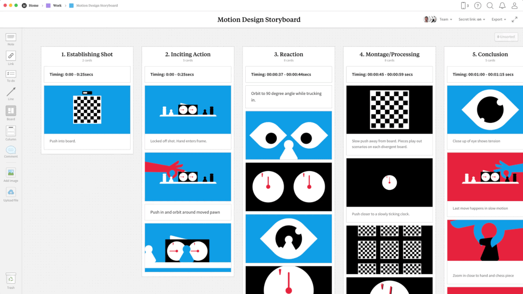
The storyboard is the pictorial version of the script. It can be done by an Art Director or by the Motion Designer directly. It is a PDF document which details the different screens of motion design and will allow you to switch to animation with confidence.
How to make a good storyboard?
- Be specific enough that there is nothing more to review when animating the content.
- Mention the associated script sentence next to each screen.
- Provide as much detail as possible on how the screens come to life and what are the transitions between each screen.
- The speech must be sufficiently sequenced. In general, a text appearing on a screen should not be more than 10 characters. If the same element (text or visual) remains on the screen for more than 3-4 seconds, the clipping is not optimal.

Step 4: The mock-up
Once all the previous steps have been validated, you must work on them to digitally create the defined graphic elements.
Step 5: Animation
The animation is the assembly of all the elements created. This is the heart of motion design: giving movement to the images produced during the mock-up stage.
Step 6: Sound dressing
Creating a sound universe makes it possible to energize your video, to facilitate the comprehension of the message by your target, and to make your motion design more attractive. The most used sound illustrations: sound design, voice-over, music.
Step 7: Adding the subtitles
In general, it is preferable to provide a version with subtitles. Especially for social networks, knowing that a lot of video content is now consumed without sound.
Step 8: Compiling the files
This is the final step: now that all the elements are created, all you have to do is export your work in different formats. Warning: the final file is heavy! In general, you will need to encode your video, i.e. reduce its size by going from a .mov file to .mp4.
15 animation techniques to create a motion design that hits the mark
To give you the best possible chance to create successful motion designs, we interviewed Anna Waldberg, Artistic Director at YouLoveWords and Motion Designer. She shares all her tips with you: it’s a gift!
On graphic consistency and homogeneity
1. The global charter
Make sure that the graphic choices embody your identity and respect your overall graphic charter (colors, typography, iconography, etc.).
2. Texts
Define text styles and adhere to them throughout the animated video. We recommend that you limit yourself to a maximum of 3-4 text styles. Example: title cards, keywords appearing on the screen, and numbers.
3. Graphic style
Define a graphic and/or illustrative style to be respected throughout the video.
4. Animation
Define an animation style for each type of element (illustration, number, etc.). Limit yourself to 3 animation styles for easy visual reading.
On the structuring of the video
5. Margins and guides
Define the outer margins and one or two structuring guides, which you will keep throughout the video. Make sure you wedge the content on it as much as possible.
6. The arrangement of the elements
Textual (texts, keywords, numbers, etc.) and visual elements (pictograms, illustrations, etc.) must be structured, aligned, and centered on the screen as much as possible. Pay close attention to this point: if the content appears on the screen in an unstructured way, the user may no longer understand anything and your message will not get through.
On the animation of graphic elements
7. Fluidity
Make sure to smooth the speeds to make the animations smoother and avoid the robotic aspect.
8. Dynamism
Your video should include enough transitions and different shots (close-ups, wide shots, etc.), not forgetting the pause times. As a guide, an illustration should never be static, and should not remain unchanged on the screen for more than 3-4 seconds.
On sequencing your video
9. The storyboard (global breakdown)
At the storyboard stage, be careful to sequence the speech sufficiently. It can be spread over different screens or split into several times on the same screen. In general, a text appearing on the screen should not be more than 10 characters. For optimal clipping, the same element (text or visual) should never remain on the screen for more than 3-4 seconds.
10. Sequencing (cutting out each screen)
On each screen, sequence the elements so that they appear at different times, one after the other.
11. The setting
If your motion design contains a voiceover, it should be perfectly aligned with the visual appearances. What is said should almost immediately be visible on the screen, then disappear as soon as we move on to the next information.
On the readability of your motion design
12. Text size
The texts must be large enough to be readable on mobile.
13. Reading time
Each of the texts must remain on the screen long enough to be read. In general, a text of 1 to 6 words should remain on the screen for 3 seconds.
14. Colorimetry
Your textual and visual elements must be placed on a background whose color does not affect their readability. Likewise, the color (s) of these elements must be adjusted according to the destination background. So pay attention to tone on tone, incompatible colors, and say “vibrant”.
15. The composition
The elements must form a readable whole. For example, avoid superimposing text and illustrations if this obscures readability.
