The year is almost over. It’s worth looking at the UI / UX trends that await us in e-commerce in 2021.
There has been a clear trend for some years now: more and more consumers are doing their shopping online. This development was accelerated even further in 2020, not least due to the corona pandemic. So far, companies that have already had an eye on current trends and developments and have increasingly focused on digitizing their business processes have come through the crisis successfully. To keep pace with the constant change in e-commerce in the new year and to actively shape it, it is important to plan the future developments in your business strategy now.
This article presents the eight leading UI / UX trends in e-commerce for the year 2021. We will also look at the present and show trends in which directions current developments can go short. What do customers expect in online shopping in the future about the ever faster developing technologies and trends? Our outlook focuses not only on purely visual issues but also on innovative technologies. We always keep an eye on the major topics of user-friendliness and user guidance.
Of course, trends can never be applied one-to-one to every project. In e-commerce, in particular, each use case requires solutions that fit the brand, strategy, products and target group. Nevertheless, it is worth looking at the trend pool to stand out from the crowd of ever new e-commerce brands with a targeted design strategy.
1.Creative product presentations
Good product presentation is mandatory for a successful online shop. Not least because this can significantly increase the conversion rate. Classic, rigid product presentations were yesterday; in 2021, the motto is: Get out of boredom and develop new, creative forms of presentation! An interesting, unconventional product presentation generates maximum attention and, last but not least, also ensures that your company stands out from the e-commerce monotony. At the same time, consumers stay longer on the page. The advantage is obvious: the longer someone stays in the shop, the higher the probability that the conversion will also increase.
So much for theory. But what can such an innovative product presentation look like? We’re taking the very unconventional trend of surreal object photos into the new year. This representation has an almost hypnotic effect, which stimulates the site visitors’ imagination and allows them to dive deep into the product world. The products are not just looked at – they are experienced. Storytelling par excellence.

A very well implemented example of innovative product presentation can also be found on a Gucci landing page, which invites the viewer to get to know the “Zumi” bag in a very unconventional way …
2.Landing page crosses product page
Itis an outdated assumption that visitors start their online purchase from the home page of a store and then continue to the product page. Rather, it is now mainly advertisements and social media posts that lead directly to the corresponding online shops’ product page. Therefore, product pages are increasingly being designed that stand on their own and present one or more product categories of the brand accordingly.
Therefore, it is becoming increasingly important to depict the products and load the product pages with stories and emotions with the help of storytelling elements. To this end, more and more landing page elements are now being built into the page, which enables users to delve deeply into the respective product and product range. This strengthens the brand feeling and arouses consumers’ desire to buy in the best of cases.

3.Moving images, 3D and interactive product images
A better shopping experience binds customers. Animations and moving images can contribute to a unique user experience.
Progressive interactive visual design such as VR (Virtual Reality) and AR (Augmented Reality) and the use of 3D images have been among the fastest-growing trends for years. They will also accompany the year 2021. As already mentioned in our trend number 1, less static product presentations ensure more movement and dynamism and help customers understand better and get to know the shop’s products. At the same time, the viewer is given a better feeling for the product. The products become more tangible, clearer and look more real overall. This means that online shopping is getting closer and closer to the shopping experience in stationery stores. The interaction between product and brand and users increases; the boundaries between reality and the digital world are becoming increasingly blurred.

Movement can not only be integrated within the product presentation in the online shop. Other areas in the shop can also be turned into great storytelling elements with videos, cinematography, or micro-animations and help create a unique user experience. The application possibilities are almost limitless.
In the meantime, technologies are becoming more and more sophisticated and also cheaper. This means that they will also be more affordable for small and medium-sized companies in the future.
This trend has already arrived in the e-commerce cosmos and will become increasingly popular in 2021 and beyond. Investing in these technologies is worthwhile.

4.Wild colour mix
A minimalist design always looks timeless and of high quality.
But how about trying something completely new and giving the appearance a strong, futuristic touch? The new trend in web design is to experiment with different strong colours and thus capture users’ attention. It can be a risk, but also an opportunity, to break through the most monotonous, uniform design of most online shops and platforms and thus clearly differentiate oneself from the monotony of the crowd.
This trend is certainly very bold and does not fit every brand and every product range. However, it is still worth taking a closer look at this exciting trend and perhaps even getting inspiration for your online shop’s next refresh.
5.Strong, dominant typography
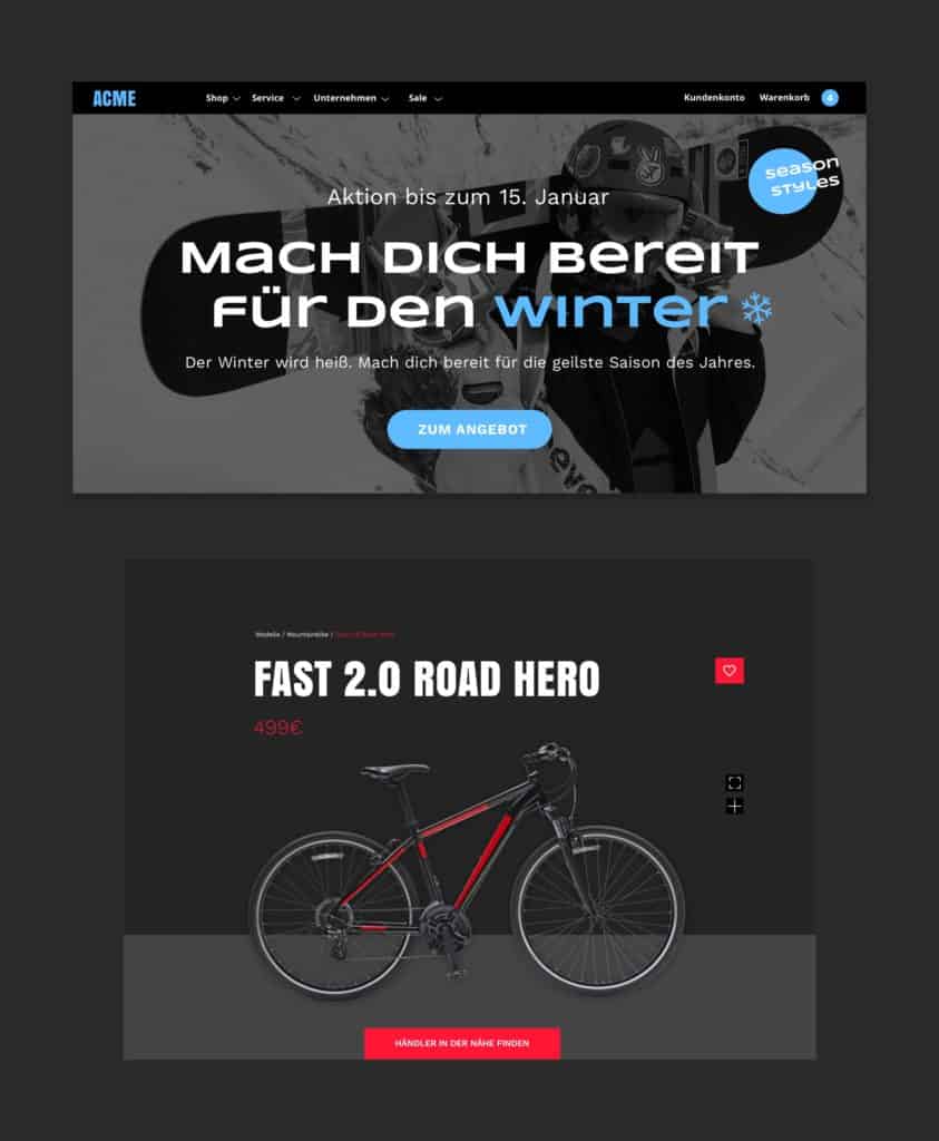
Another hot trend that has already emerged this year and is becoming increasingly popular is playing with eye-catching, large-scale typography.
The headline is usually the first element scanned by the viewer’s eye. Through strong typographic elements, certain areas in the shop, such as categories or certain products, can be highlighted even more and thus receive more attention. Simultaneously, a hierarchy within various elements creates a balanced balance, guides the users’ gaze through the page in a more targeted manner and increases overall user awareness.
6.Soft shading and floating effects
The next design trend for the coming year is pretty much the exact opposite of the previous trend. And like many trends, this design approach is not there for the first time but reinvents itself repeatedly.
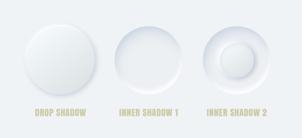
The use of floating effects and soft shades in UI elements can already be found in Google’s Material Design from 2014. In the coming year, minimalistic, clean and tidy surfaces will increasingly be used in UI elements. Soft surfaces are designed that are reminiscent of extruded plastic and appear as if they were fused with the surface or were floating above the surface. The design of these effects gives the web design a wonderful spatial depth and makes the interface more complex and interesting. Light and the floating atmosphere is created, which is different from the classic flat design often used.
These effects can be used for almost all UI elements (text, images, boxes, buttons, etc.) but should be used sensibly and with care to guide the user and not achieve the opposite.

7.Dark Mode (blackout mode)
Those who design in dark mode are right on trend and give their interface a modern, urban touch. Certain elements can also be easily highlighted and brought into focus. Also, it has been proven that a darker screen colour results in less eye strain. Thus, the “dark mode” should not only be seen as a purely visual trend but can also represent a user-friendly extension of your brand presentation.
However, the dark mode should never be viewed as a stand-alone solution but always requires an additional light variant, as the strain on the eyes is reversed in the dark mode in bright sunlight. The extent to which this trend will also prevail in e-commerce and how useful and effective it will be there cannot yet be foreseen exactly. This topic divides the minds, and it is worth considering more fully.

8.Photo-graphic mixed media and illustrations
To effectively support your own company’s branding and create individuality within the product advertising, atmospheric photographs, which are enhanced by graphic or illustrative elements, can make a great contribution. It is important to always work with messages and clear statements that convey the brand or product message. Meaningless pictures and graphics are from “the day before yesterday.”
A lot of individuality can also be created through hand-drawn illustrations. The brand becomes more authentic, appears friendlier and arouses positive emotions in the viewer. The completely perfect elaboration of the illustrations is not necessarily relevant; especially the imperfection can bring character and humanity into the design – two aspects that are becoming increasingly important in e-commerce.
Conclusion
As you can see – from a UI / UX perspective, the year 2021 will be diverse, inspiring and exciting! Design and technology continue to merge. Many UI / UX trends from this or previous years will be carried over into the next year and will continue to develop. In this way, new and impressive user experiences can be created for online trading. The topics of personality, trust and customer loyalty will also increasingly come to the fore. The developments go towards more and more personalization and humanity. This requires even more creativity and a more target group-oriented approach.
With this in mind: stay inspired and make the e-commerce world a little more colourful with unusual and creative shop concepts!
