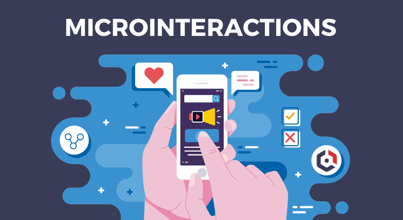
Almost everyone knows them and uses them every day. With animations, transitions, or a distinctive tone, they convey a web app’s status or help avoid errors. They are seldom noticed consciously: but if they are not there, they will be missed. We are talking about microinteractions.

In web design and web development, these often differentiate between a good and great user experience.
In this post, we will explain what microinteractions exactly are, show you excellent examples and give you five tips with which you can tease out the best user experience for your users.
What are microinteractions?
It’s the little things that make an excellent digital product great. This is how Dan Saffer describes Microinteractions in his 2013 book “Microinteractions: Designing with Details.”
Dan Saffer has been one of the leading digital product designers since 1995.
Many everyday interactions with computer systems are microinteractions. For example, they give the user a web app feedback that their input has been recognized, processed and executed.
They show the system status, help avoid errors, draw attention to incomplete entries, or signal a new message’s arrival.
These are small animations and transitions, which make movements on display look real, or an acoustic signal.

The four components of microinteractions
A microinteraction always relates to a single-use case, e.g. switching a device on or off, like a Facebook post or a YouTube video. Dan Saffer divides every microinteraction into four components: trigger, rules, feedback, loops and modes.

1.Trigger
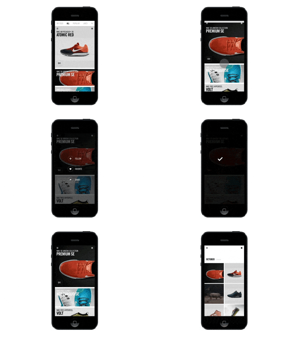
Triggers are the points at which microinteractions begin. Triggers are often the first thing a web app user sees when starting an application or turning on a device.
Such triggers are a button or an icon for fast forward, a toggle switch for choosing between two states, e.g. ON / OFF, or a slider / rotary control for actions with several defined states.
2.Rules
The rules determine what happens when a user has used a trigger. These are the parameters that the micro-interaction follows. For example, what happens when you click the Like button on Facebook.
The rules define precisely what happens after a trigger is executed. The rules determine what control the user has over an ongoing micro-interaction.
Whether he can cancel a download, change the volume or manually trigger an otherwise automatic process such as checking e-mails.
For example, one rule would be that the search function user must enter a search term into the search field before the “Search” button becomes active.
3.Feedback
Feedback is one of the most critical components of any microinteraction. The input shows users that something is happening has happened, and often what is happening.
Loading bars, for example, show the progress of downloading files. A change in colour indicates that the desired action has been carried out successfully or whether an error has occurred.
4.Loops and modes
Loops determine the length of the micro-interaction. They determine whether the interaction is repeated or whether it changes over time. If you have activated the alarm clock, for example, it will ring at the preset time.
If you don’t react, the ringtone repeats itself after a specific time. Not every micro-interaction has to be repeated. Modes or modes control actions that do not require repetition.
They change the way it works. For example, if you activate the “Do not disturb” mode on your smartphone. In his book, Dan Saffer recommends avoiding fashions as much as possible.
How can microinteractions improve the user experience?
Microinteractions influence the user experience of a web app in different ways. First and foremost, they provide feedback to users and communicate the system’s status or an application.
Microinteractions give users the feeling that they can manipulate the application directly, that they are in control. And, they help users see the result of their actions right away. Microinteractions improve the user experience by
- improve the navigation of a website
- make it easier for users to interact with a web app
- Provide instant feedback on completed promotions
- Convey information about specific elements
- draw users’ attention
The animation of the thumbs-up symbol on Facebook Messenger is an excellent example of a micro-interaction. The spirit communicates the status and gives the user feedback.
This gives the user the feeling of direct manipulation. The application follows his instructions. More comfortable, but still informative, is the colour change after clicking on the thumbs-up or thumbs-down symbol on YouTube videos.
WhatsApp gives its users several feedbacks depending on the status of the messages. As soon as a text message has been sent, the message moves up a little in the display.
A gray checkmark at the bottom of the message field indicates to the user that the WhatsApp server has received the message. A second gray tick indicates that the message has been delivered to the recipient.
When the recipient has read the message, the checkmarks change from gray to blue. When sending a voice message, the message also moves upwards.
A circling progress bar signals to the user that the message is being transmitted. After the transmission, the message is marked with a cross, the successful news is also confirmed with a signal tone, and a gray checkmark is set.
As with text messages, there is a second tick, and, if the message has been listened to, the tick changes colour.
An indispensable but straightforward micro-interaction for smartphone and tablet users is the confirmation tone when a button is pressed. In the case of a PC keyboard, the feedback occurs via the resistance and a quiet click when a key is pressed.
Since this is not possible with a display, the sound provides the necessary feedback.
Five tips for designing microinteractions
When designing microinteractions for a web app or other application, you should always keep in mind that micro-interactions should be subtle, non-disruptive moments for the user that revolve around the execution of a single task.
The following five tips can help you design the perfect microinteractions for your application.
Tip # 1: Use functional micro-interactions
First of all, the micro-interactions must have a purpose. After all, they are designed to encourage users to interact with a specific web app.
Ensure that the animations serve a functional purpose and do not feel uncomfortable or annoying to the user of a web app. Functional microinteractions convey the feedback given by the system best.
A perfect example of functional microinteraction is the progress bar when downloading files.
Supplemented with information on the possible remaining time, the amount of data already downloaded, and the amount of data remaining, the progress bar conveys the status much more clearly than an egg timer that turns at short intervals.
Tip # 2: KISS – Less is more
The US Navy already described the KISS principle (Keep It Simple, Stupid) in 1960 as a permanent construction principle. This principle also applies to web design and the development of microinteractions for a web app.
Imagine a pulse effect that appears anywhere in your application with every click of a button. This is certainly not a good experience for the user. Excessive feedback will quickly irritate and distract the visitor.
Tip # 3: Microinteractions have to live a long time
Micro-interactions must survive long-term and should be consistently pleasant. Would the user find the micro-interaction helpful and friendly even the 5th, 10th or umpteenth times they interacted with it? This goal can be achieved with intuitive and targeted transitions, as well as simple and flat symbols.
Tip # 4: Create visual harmony with other UI elements
The micro-interactions should be designed according to the application’s general style and support a harmonious perception of the product. Considering each micro-interaction environment is critical and conveys a holistic, coherent approach that contributes to a smooth and seamless user experience.
Tip # 5: test and experiment
Experimenting with different micro-interactions in your application and collecting user feedback is essential to improve user satisfaction significantly.
Conclusion: Micro-interactions can be the killer feature of your application
Microinteractions are the details that turn a web app into a great application that users love.
You have the power to completely change a person’s experience with an application and make people comfortable using your product.
The small details play a super important role in web design today. Design them with care without reinventing the wheel.
Think about how people are working with and using your application. Attention to every single detail is guaranteed to be the key to the success of your application.
