A website is like a house. Guests enter through an attractive entrance. There are rooms with different functions and suitable facilities. Everything has its place. The great art is to design the architecture of the website so that your guests feel comfortable, always have an overview and can quickly find all the essential information.

Website development Step 1: Question about target and target group
Before we start to develop a concrete website structure, we ask ourselves a fundamental question: What is the goal of the website?
It sounds simple at first.
You could say: “I want to sell my products.” Or: “I want to win new patients.” Or: “I want to increase my brand awareness.”
Each of these goals requires a suitable strategic implementation. Means: You need, for example, an online shop (for sale) or an online appointment planner (for patients) or a blog for content marketing (for example to position yourself as an expert).
Also, the accurate analysis of your target group is essential. Because you can better achieve your website goals if you address your target group at eye level, at this point, market researchers are a great advisor because they can draw a clear picture of your target group.
An alternative is the evaluation of your existing customer data. For example, you can ask yourself the question: Who bought what from us for what reason? Or: At what age and with what problems do patients come to our practice?
And what does all this have to do with building a website?
Building a website is not an end in itself. A site should show solutions, give answers and create added value.
Make yourself aware:
- You don’t sell irons; you sell wrinkle-free shirts.
- You don’t sell shoes; you sell a lifestyle.
- You don’t sell hip prostheses; you sell agility and freedom.
But it goes on:
A very young target group may feel more addressed by a modern website structure with surprise effects, free gimmicks and fast functions. Older customers may prefer to use their home PC and need classic buttons with large letters and a suitable colour guidance system. All of this is target group-specific information that is important for the construction of your website.
Or imagine that your leading target group is in Spain and the Netherlands. You are wasting potential if you do not integrate your country pages as subdomains when building your website.
Result step 1 (checklist):
- ✅ You can name the destination of your website
- ✅ You know your target group very well and have a feeling for what you want and how it should be addressed.
Website construction step 2: All content on the table

Your company offers products, services or content. They have visions, experiences, maybe even their methods and skills.
Now write all of this together. Not alone. Ideally, along with colleagues from different areas of your company.
My tip: We use either a full whiteboard or a large piece of paper to brainstorm the content. And: order does not yet play a role in this step.
Have you written down all the essential information and topics?
Very good.
Now take coloured pencils.
Now circle, underline and mark all content that belongs together with the same colour.
What is being created here is the first rough structure of your website.
Result step 2 (checklist):
- ✅ You now have all the content fields and subject areas that are important for your website sorted in colour.
Website development Step 3: Analytically refine topic areas
The subject areas are now sorted by colour. These topic clusters are the ideal basis for building your website. You currently have all essential content right in front of you.
Shortstop.
We now go from the inside perspective to the outside view. From your self-considered entrepreneurial perspective into the angle of your looking customer.
The goal is to analytically refine your topic areas – using specific search volumes and keyword phrases of your target group.
At the moment, your paper or whiteboard may still say:
- we sell shoes
- different models
- for men and women
- Sneakers
- Ballerinas
- noble sandals
- (…)
With an analysis tool, you can now find other related keywords and search phrases.
The free keyword analysis tool UberSuggest provides a first overview.
With just one click, you can find out what the search volume for a keyword like “ballerinas” is.
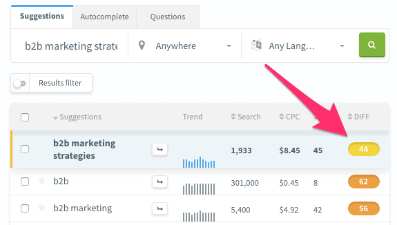
Below is the UberSuggest keyword ideas list are two keywords that have a significantly lower search volume but are more comfortable to place on the SEO side (difficulty of 44).

What does that have to do with the construction of the website?
In addition to a category page for ballerinas, it could make sense for you to also build search-engine-optimized subpages for the keywords “ballerinas with straps” and “ballerinas with heels”.
Blog topic: Also, detailed keyword analysis is an excellent source for blog topics. You may find out that many people are looking for an answer to the following question: “What to do if ballerinas smell?” This is an excellent foundation for writing help content that will attract new readers to your site, who may become new customers in the future.
Result step 3 (checklist):
- ✅ Based on keyword research, you have developed an extensive list of additional ideas for relevant and searched questions and topics of your target group.
- ✅ You know correctly which keywords can be used to advantage. ✓
Website construction Step 4: Specific page types
Now we are sorting all content into meaningful areas. Different page types are available for building a website. Here is a possible selection:
- Home (homepage)
- Subpages
- Company page
- Information pages
- Contact pages
- Blog
- Topic pages
- Blog posts
- Shop
- Category pages
- Product pages
- Applications
- Order forms
I will now use two-page types (the start page and a bottom page) to show you how a clear structure can look like.
Example 1: Structure of the start page
The home page is the entrance area. Many of your visitors/customers enter your website here. Explain briefly and crisp, who here what for whom offering.
The attention span on the Internet is minimal. This means: your message must be clearly understandable and quickly perceptible.
Our tip: Show an ignorant person your home page for 5 seconds and then ask him: Who offers whom which added value?
The home page should have three areas:
1. Homepage header
It contains the main claim or an appropriate advertising address. In the background of the header can be an image, a slider, a video or a plain background.
Tip: Do not use stock photos. They look artificial and interchangeable.
Your logo and the main navigation with prominently arranged contact options should also be placed in the header (in practices with online appointment making).
2. Content area (body) of the start page
Ease of consumption is essential in the content area. The running width of the text (line length) and the font size are important here.
The body on the homepage of a website carries all-important content segments of the entire site. Our tip: First try to view the start page like a one-page website that teases all other areas and subpages. A user must be able to quickly get an overview of your company, your products or services here.
3. Footer of the start page
Imprint, data protection declaration, social media links, general terms and conditions (for shops), certificates and the contact page are linked in the footer.
The home page is the heart of your website. From here, your visitor should come to every area of your website with as few clicks as possible. Some online marketers give a maximum of 5 clicks. We recommend a maximum of 3 clicks.
Our recommendation for your homepage:
- ✅ Keep your website structure flat. A maximum of 3 clicks for each content.
- ✅ Build your home page. It should be easy for the visitor to understand as soon as they are scrolled through.
- ✅ Keep your website structure lean. The loose presentation has a positive effect on usage.
Example 2: Building a subpage
Subpages can have different topics. Starting from the start page (which should give the visitor a holistic and straightforward overview), the user can access further subpages.
A look at the practice:
You teaser your services briefly and succinctly in one segment on the homepage. After clicking, your website visitor will be taken to the relevant subpage. This could be a category page that shows all products and services at a glance.
The underside should visually match the start page, but at the same time, stand out.
This sounds contradictory at first, but it’s straightforward.
On the one hand, the visitor should have the feeling that they are on the same website all the time, across all pages of a website. Substantial design changes in colour and shape can give the impression that you are suddenly somewhere else.
On the other hand, the visitor should get the feeling that the bottom is a deepening of content. The visitor clicks on the next level and is also welcome to feel it in the display.
1. The header of a subpage
Make sure that your visitors find their way immediately on the bottom. This includes:
- a bright and activating heading (general word games, unspecific descriptions and misleading wording can confuse the visitor)
- A suitable picture, video or a coloured header design (depending on the product, service and target group) can have an activating effect
- Main navigation (for orientation and guidance)
2. Body of a bottom
The following applies to the content area: The text body must be easy and quick for the visitor to consume. It is therefore essential to note the running width of the text (line length), the font size and a balanced text-image ratio.
At the beginning of this section, I sketched an example – a subpage as an overview page (category page) for all of your services.
For example, a category page needs the following segments in the body area:
- SEO segment: Search engine optimized text pursues the goal of generating organic customer traffic via the search engine
- Filter segment: a box with filter functions enables quick selection and precise navigation
- Image segments: high-quality images of your products appeal to visitors emotionally and make the products visually tangible
- Contact segment: the moment questions arise at the customer, he must be able to ask them as quickly and efficiently as possible
3. Footer of a bottom
The footer of the subpages is designed analogously to the footer of the homepage on many websites.
A tip: keep your footer clear. Little information is often sufficient. Large blocks of text in the footer are most challenging to read for the eye AND can create unwanted duplicate content. For example, Google rates 20 subpages with 20 identical footer texts as identical duplicates, which can hurt the ranking of a website. Your website maintainer can solve this in a few simple steps.
