The appearance of a landing page can be compared to an interview. The applicants want to look prepared, fit and appealing. Your goal should be to communicate with the visitor and make it clear that you have precisely what he is looking for and convey it in a way that suits your company.

Another similarity between landing pages and interviews? Do not directly accept the first option. Try different ones and only then decide.
The look discreetly and subconsciously conveys information and “instructions” that help the visitor decide. It can supplement and emphasize the content of texts to convince better or even replace the text to give a visual, shorter impression.
Here are a few commonly used tips and tricks to help increase conversions on your landing page.
Represent something intangible, tangible
It is a nice feeling to unpack something and hold it in your hands. Unfortunately, not all content offers, like most digital products, can be touched. To still give the impression that the customer can feel something, the content can be displayed on a device (e.g. on a smartphone).
This method is also in line with research on successful Facebook ads. The variation that fared second-best had a physical representation (the best surprisingly had a meme).
Let’s take a look at HubSpot’s landing page for an eBook:

This landing page offers a picture of a tablet, which shows the content and gives the visitor a little taste of what he could get. For example, you make something intangible tangible.
Offer an interactive demo
One way to gain visitor trust is to use an interactive page. Please take a look at the MonoType page; for example, It is a smart landing page that immediately shows what it is about. Visitors can change fonts in real-time to see what they look like. They get an idea of what to expect before committing to any form or anything else. Ultimately, you would also like it better if you could try on a t-shirt before you buy it, wouldn’t you?

Use icons or pictures to tell something
Many companies use images and illustrations to tell a story and do without standard symbols. Many like this. This keeps the visitor attentive and interested on the page. This method enables a lot of creativity with pictures and a story. And because stories are useful for conversions, they are great for landing pages. Intercom’s landing page is an excellent example of this: the illustration reinforces the content and simplifies the concept. A story is told. On the first picture, you can see a lot of “people” who can not communicate efficiently and relaxed; you can also tell from their confused facial expressions and the chaotic arrows.

In the second picture, however, you can see a much simpler illustration – a clean and straightforward line between two “people”, you and your customer, which implies simple communication.
Use icons and pictures to highlight or replace texts
Pictures speak more than words. This is an advantage that we can take advantage of. The visitor also directly understands what is meant, for example, with a Twitter logo – no text required. In some cases, the meaning of icons can reinforce the text or the motto of the page.
Let’s take a look at WordStream’s landing page for eBooks: the icon of the cup makes visitors think they could win. It also makes the reader curious and motivates them to read the text next to them to know what is on offer. Isn’t it practical?

Use CTA buttons with colours that catch the eye
If you look around, there are many different opinions about the colour of buttons for conversions, especially for CTA buttons. At least one view has one piece of evidence: CTA buttons are more effective if their colour is in contrast to the page.
Unbound’s site is an excellent example of this. The orange CTA button is in contrast to the background colour: the button stands out – and that should be the same.

We also successfully implement much of what you read here with our customers
For example, take a look at the landing page for diagonal roller shutters from the Schanz company: If you are looking for a colour, you can use this colour wheel. Just find the colour of the background and take the opposite colour.

Use images that point in one direction
Show your visitors the right direction, guide them to the action. This can be done, for example, with visual cues. Whether implicit or explicit, they can guide the visitor to the goal.
What is meant by implicit and explicit? An implicit hint can, for example, be a person looking at the CTA button. Specific advice can be an arrow that clearly and directly points to something.
Implicit notes
The principle behind the implicit clues is what Malcolm Gladwell calls “microexpressions “. Small or fleeting glances that we perceive to understand the emotions of others. Eye-tracking
Studies show that when people see someone new, they look at the face and expression first. When visitors see a picture with someone looking at a product or form, the chance of a positive reaction increases. This kind of visual cues can also be very subtle and subtle, our subconscious notices. Let’s take a look at the Copy Hackers page :

The text and the image are positioned so that the copywriter Joanne Wiebe looks at the version and her hands are close to the CTA button. Without any arrows, the page leads you to read the text and shows the user where to click. A good implicit visual hint makes the click look like the next natural step.
Explicit notices
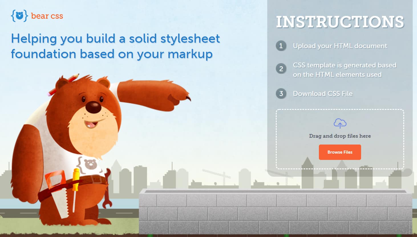
Implicit clues are subtle and invisible at first glance, but not exact. On the contrary, they should be visible at first glances, such as arrows, fingers or illustrations that point to something. Bear CSS’s landing page
Is one example: The (sweet) bear indicates very clearly to the CTA button. If something like that doesn’t fit your company, IMPACT’s site is another excellent example: The arrow indicates to the CTA button. The shaft here also has an animation, another good visual clue that guides the visitor.

Note
However, professionals among web users would not trust the cute bear. A site without SSL !?
Real people show
Real people (no bears or illustrations) do an excellent job on landing pages. MarketingExperiments conducted a study that compared two landing pages. One with a standard photo of a smiling woman, the other with one of the company owners.
The result was clear. 35% of the visitors filled out the form on the version with the owner then this with the woman. For your information: Not only was a picture of an owner shown, but the text also said that it was one. Showing the right people helps to build trust and increases recognition value.
Make something of it
The landing page is often the only way to make a good impression. It would help if you always kept that in mind. Choose a design that captures the visitor. He shouldn’t want to click away or overlook the page. Of course, the right design also needs some planned testing.
While it may be tempting to choose a modern-looking and beautiful design, you should be strategic with landing pages. What good is a lovely design if nobody takes the next step, right? An appearance is a powerful tool when used correctly. Use design and presentation to show your company at its best and to make a good impression.
