The home page is, without a doubt, the most crucial page of an online store. It has the power to propel sales, but if it is not strategically designed, it can also hurt the business much. To prevent this from happening, we must use different techniques and tips to create it so that it is effective.

This page is responsible for creating an excellent first impression for the entire store. Still, it can also help us win the trust of visitors, challenge them and guide them effectively to convert them into customers.
It’s a lot of pressure for a single page!
There is no magic formula or unique recipe to apply to all e-commerce; there is no “one size fits all” that is effective. Many factors are to consider: is it a page that must highlight a unique product? A handful of niche products? Or instead hundreds of products of different categories? Of course, we must also keep in mind the audience we are addressing, the niche we are in and the type of business, etc.
However, there are some golden rules to follow and several tips that can be applied to all sites to maximize the effectiveness of the home page.
How to capture the attention of visitors
When a visitor is on the home page of our online store, we have about 10 seconds to hang it and encourage him to continue his visit. That’s why it’s so important to find an effective way to get your attention. We must present him with an element that will excite, intrigue, impress, surprise, make him laugh. In short, a unique way to make him want to stay in the shop and become a customer today.
Highlighting high-quality photographs on the homepage can have a significant impact, whether it’s product photos or product staging in a “lifestyle” context (Ikea, for example, is a past master in this art!).

Quality images featuring products are an effective way to attract attention. Image Source: Ikea Canada
If it’s possible, posting a video on the home page is also a great way to grab attention. For example, it can be a promotional video that shows what makes the products stand out and how they can make a difference to their lives as Sonos does, or like the Crossrope company that presents a video mute in the background of his call to action on the homepage.
In short, we must find an original way to capture the attention of visitors and make them want to know more about our products while remaining true to the corporate culture.
Differentiate yourself from the competitors
After capturing the attention of visitors, it is also essential that they know the benefits of making a purchase on this shop rather than that of a competitor.
If we offer free shipping, we have a policy of the lowest price, we provide an extraordinary offer, or our products stand out in one way or another, visitors must have access to this information quickly and display it.
The personality and values of the company must be reflected on the homepage. Why should customers buy from your business?
In other words, we must make sure that the idea of going to look for a similar product on Amazon does not even touch them the spirit.

For example, the home page of the Pangea site stands out in this aspect. It attracts visitors’ attention effectively, whether in its call to action at the top of the site or through the images and videos that are presented over the of the page. Admit that it makes you want to order a map!
How to convert visitors into customers
Once we have caught the attention of visitors and aroused their interest, it is imperative to present them with a call to action, ie a phrase like “Take advantage of this offer now” or “Get you a (product name) today! “followed by a clickable button that leads them to the shopping cart and the payment page.
This button should be hard to miss: so make sure it is big enough and of a colour that can not be found anywhere else on the page. We do not want to fall into the “questline” lousy taste either, so no trick that “flash” highlighted in fluo.
Also, the call to action should ideally be present in several places on the page. The visitor should not have to look for it if he decides he is ready to buy. As the home page scrolls, we can integrate several buttons (but still the same colour) by varying the formulation of the call to action.
For example, Osmo, which features a children’s game system that uses an iPad or iPhone, integrates this strategy very well.
How to simplify navigation
This point is mostly about online stores that have a large inventory of products for sale on their site, but this principle should apply to all locations.
Visitors do not visit the site of an online store to play “where is Charlie”. They must be able to find and buy the product they are looking for easily and quickly; otherwise, they will look elsewhere without thinking twice.
First, the home page of an eCommerce that offers more than one product must, therefore, include two elements: a concise and straightforward navigation bar and a search bar.
The navigation bar is essential, but you have to be careful not to overload it. Do not fragment the stock into 15 categories, each with 30 sub-categories and each with a tab; A simple and logical structure should be established to ensure that a visitor can quickly find a product with as few clicks as possible. The more options there are, the more complicated it is for the visitor to know if he has gone the right way to find what he wants.
To simplify the main navigation bar as much as possible, you can use the footer navigation bar to link to information pages such as “about”, “delivery policy”, “contact us”, etc.
As for the search bar, it must be straightforward to spot and not hide in a corner where only to be revealed by a cursor. Think about it for two seconds; let’s say you have a clear idea of what you want and go to Amazon to buy a Bose brand noise-cancelling headset. Do you click on “Shop by Department” and “Electronics” then “Headsets” to then click on “Noise Suppression” and check “Bose” in the options? Of course not. You use the search bar and type “Bose noise-cancelling headphones”.
A customer who arrives at the shop and wants to search for a specific object or type of article must be able to search very quickly, either by the navigation bar or the search bar.

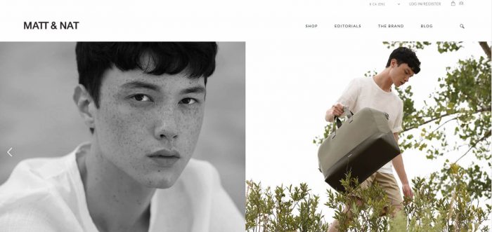
The Matt & Nat home page, for example, has a sleek design and simple navigation despite a large number of products and categories.
Clean up as much as possible for an effective homepage
When we create a home page, we do not generate the biography page of our company, we do not create a press review page, and we do not create a fact sheet that lists every detail of our products.
When creating a home page, we must create an experience for the customer. We want to create an emotion.
That said, if you do not think strategically about the creation of the home page, it can quickly turn into a mess that, in the eyes of a visitor, will look like a canvas Jackson Pollock. But unlike the art of abstract expressionism, the purpose of a home page is not that the visitor watches it for hours reflecting on the artistic sense of what he sees and the use of it — hidden behind!
We must clean the home page to the maximum and create a coherent visual suite that “breathes” well and does not overwhelm the visitor. It’s all about balancing the essentials, the message and the calls to action.
We must forget the old way of doing things that wanted us to use the home page as a presentation page of the company, its team and its achievements. Putting more information than necessary will only dilute the main message in a sea of non-essential details.
The Trublooms home page, for example, was designed with this in mind.
Here’s another quick little trick to improve the visual efficiency of the homepage: drop the image carousel.
The vast majority of tests performed between the efficiency of an image carousel and a still image come to the same conclusion: a carousel is not as effective.
Instead, a fixed image that enhances a product or has a clear call to action. Or if we want to put a carousel, we must make sure that the images contain the same call to action and do not deconcentrate the eye too much, like the site of the Pangea maps that we talked about earlier.
In short, we must keep it simple, having in mind that, in terms of the home page, “less” can give us “more”.
Optimize the site for mobile devices
One of the essential elements not to overlook, for the home page (and the website in general), is to make sure that the design is “mobile-friendly”, i.e. which is optimized for mobile devices like tablets and phones.
Every year, the proportion of transactions made by mobile device increases and so e-commerce must adapt to this reality at the risk of losing sales and customers.
Most visual editors can preview mobile pages, so be sure to use this feature and double-check that everything is displayed as expected and is easily readable once the page is online.
This is also an excellent reason to simplify the navigation and purify the home page, as mentioned in the previous points.
Add a Popup to the shop’s home
The home page of an online store is an excellent place to include a Popup in order to present an offer to visitors and collect their email address to be able to keep in touch with them with an email marketing strategy.
This is a straightforward and particularly useful way of interacting with visitors. Two of the most popular tactics are to offer free shipping or a percentage discount on an order. You can also use this technique to encourage people to browse a specific section of the store, such as the Simons company that offered free shipping with the purchase of a swimsuit in its homepage popup.
Many place themselves firmly against popups because they can be unpleasant and divert attention from the homepage and the main message.

However, this is a proven method. Just make sure to include in our popup a proposal that the visitor will really appreciate, not just say “Subscribe to my newsletter”, it does not bring him any value.
In conclusion
The home page of an online store must be strategically designed to capture the attention of visitors and guide them through the purchase process to convert them into customers.
First and foremost, it is essential to define the objectives of the page and determine which metrics can confirm its effectiveness.
Then you have to think about how one can create a unique experience for the visitor and stand out from our competitors.
You can use different tactics to make our homepage useful. For example: capturing the attention of visitors with quality visual content, highlighting the advantages of our offer (products, customer service, delivery policy, etc.), presenting calls to action in a clear and unmistakable way, simplify the navigation, purify the design, optimize the site for mobile devices and use the popup technique to present an offer to visitors while collecting their email address.
Of course, you have to adapt these tips so that it makes sense for the company, what it has to offer, and the customers it targets. The ideal would be to create some variations of the home page and perform A / B tests to confirm the effectiveness and compare conversion rates.